

Back to Page
Amazon A+ Content
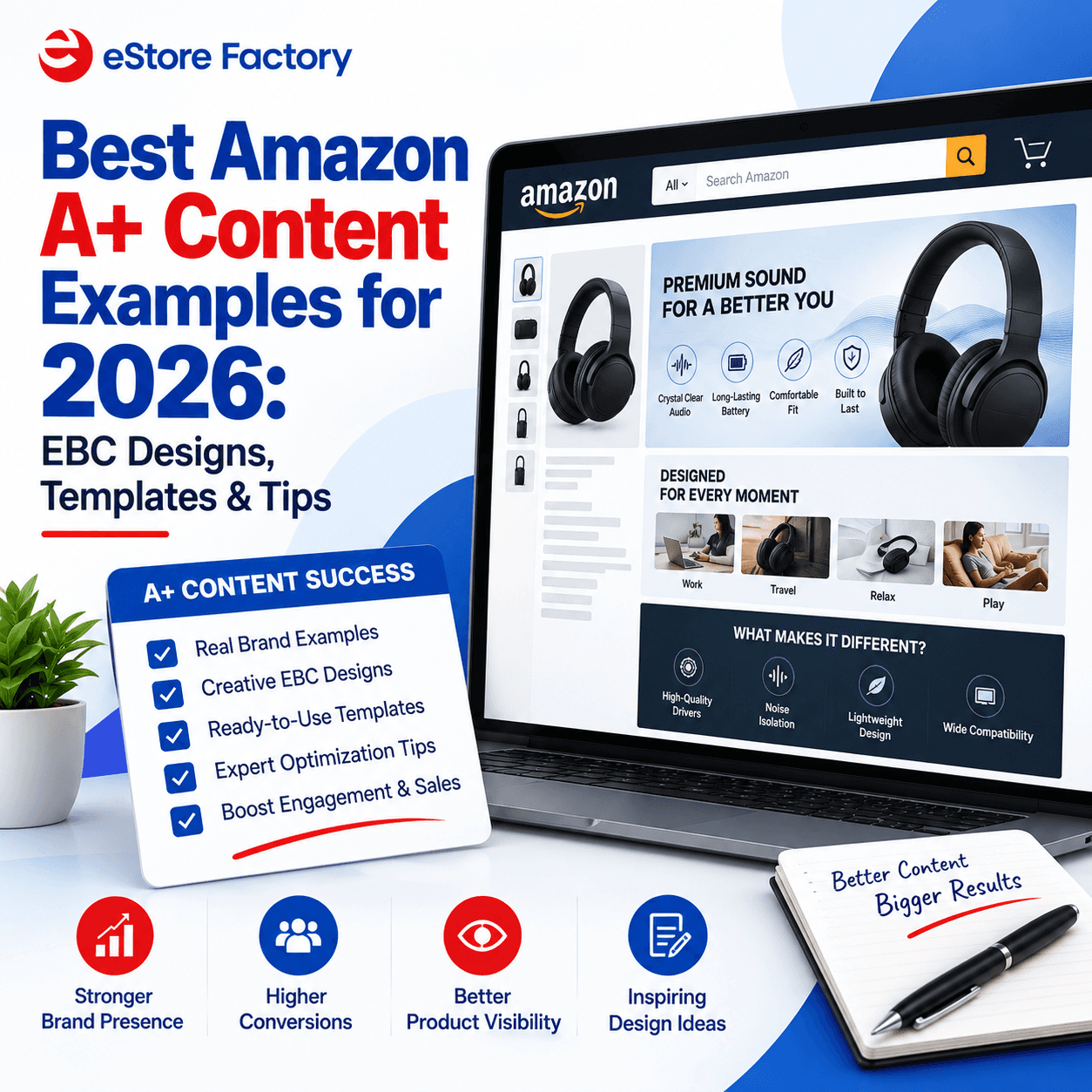
Best Amazon A+ Content Examples for 2026: EBC Designs, Templates & Tips
Best Amazon A+ Content Examples for 2026: EBC Designs, Templates & Tips
Back to Page
Amazon A+ Content
Best Amazon A+ Content Examples for 2026: EBC Designs, Templates & Tips
Amazon shoppers do more than compare prices. They look at images, product benefits, brand credibility, and whether a listing answers their questions quickly. That is where A+ Content can make a product detail page more persuasive.
Formerly known as Amazon Enhanced Brand Content, A+ Content lets eligible sellers use richer images, text, comparison charts, and branded layouts instead of relying only on a standard description. For an Amazon FBA seller, strong A+ Content can make the product easier to understand and create a more consistent brand experience.
Below, we have updated our Amazon A+ Content examples for 2026 and added practical design ideas, templates, and current Basic versus Premium A+ guidance.
What Is Amazon A+ Content?
Amazon A+ Content lets eligible sellers present product information through enhanced images, customized text, comparison charts, and branded modules. Amazon currently offers Basic A+ Content, Premium A+ Content, and Brand Story. Premium A+ adds options such as video, interactive hotspots, carousels, Q&A modules, and enhanced comparison charts.
Amazon says Basic A+ Content can increase sales by up to 8%, while well-implemented Premium A+ Content can increase sales by up to 20%. The real value is not simply adding more graphics; effective A+ Content should make the product easier to understand and help shoppers make informed decisions.
16 Best Amazon A+ Content Examples for 2026
The strongest Amazon A+ Content examples do not just look attractive. Each module should introduce the product, explain a benefit, show the item in use, or help shoppers compare options.
1. Acorn Solution
This design uses clear branding and focused visuals. The main lesson is to keep each module focused on a single message rather than cramming multiple benefits into it.
2. Gadget Store
This example shows how feature-led products can combine visuals with short copy. Translate technical features into language shoppers can understand quickly.
3. VitaVerve
VitaVerve uses lifestyle imagery to help shoppers picture the product in use, making the approach suitable for wellness, beauty, and fitness categories.
4. Xeners
This Amazon A+ design separates product features from supporting information, making the page easier to scan without large blocks of text.
5. Orga Ecofriendly
The design connects product information to a recognizable brand theme, which is useful when materials, sourcing, or brand values influence the purchase decision.
6. Carbo
Carbo uses visual hierarchy to move shoppers from the main benefit to supporting details, keeping the most important message prominent.
7. Brush Creek Shop
Lifestyle imagery provides context around the product and shows how it can fit naturally into the customer's everyday use.
8. Abwage
Abwage organizes multiple features without making the page feel crowded by using short headlines, focused visuals, and concise supporting copy.
9. Dodjivi
This example balances brand personality with product explanation, helping functional information and visual identity work together.
10. Rexy Sports
Action-oriented lifestyle imagery helps demonstrate realistic use cases, making product benefits easier for shoppers to understand.
11. Orga Ecofriendly – Alternate Layout
This variation shows how consistent typography, image treatment, and messaging can keep different module arrangements visually connected.
12. Yara
Yara uses clean visual blocks to present several benefits in an easy-to-scan sequence without unnecessary technical detail.
13. Heather & Willow
This example combines imagery and emotional positioning, showing how lifestyle-focused brands can communicate atmosphere as well as product benefits.
14. Acorn Solutions – Alternate Design
This variation shows why module order should reflect what shoppers need first: benefits, specifications, instructions, or comparisons.
15. Sunday Road
Sunday Road uses a cleaner brand-led presentation. White space and concise messaging keep the A+ page easy to consume.
16. Masao Mask
This example uses visual explanation to communicate value quickly, combining close-up imagery with brief benefit-focused copy.
What Makes a Good Amazon A+ Content Design?
A strong Amazon A+ design should help shoppers understand the product faster, not simply make the listing more decorative. Start with a clear hierarchy: lead with the main benefit, then support it with features, lifestyle imagery, usage information, and comparisons where useful.
Keep copy concise and design for mobile as well as desktop. Use consistent fonts, image treatments, and brand elements. Comparison charts are especially useful when shoppers need help choosing between products in the same catalog.
If your current page feels cluttered or inconsistent, an Amazon listing optimization service can help improve the structure, copy, imagery, and overall presentation.
5 Amazon A+ Content Templates You Can Use
There is no single Amazon A+ Content template that works for every category. Choose the module flow according to what shoppers need to understand.
Template | Suggested Flow |
Benefit-led product | Hero benefit → Key features → Lifestyle use → Comparison |
Technical product | Hero → Features → Specifications → Use cases → Comparison |
Beauty or wellness | Lifestyle → Key ingredients/features → Benefits → How to use |
Home and kitchen | Problem/solution → Features → Lifestyle → Instructions |
Premium brand | Brand story → Hero benefit → Detail modules → Proof → Comparison |
Use these as starting points rather than rigid formulas. Your Amazon A+ Content template should reflect the product, category, customer objections, and available creative assets.
A good Amazon A+ Content template makes it easier to maintain a consistent structure without forcing every product into the same layout.
Basic A+ Content vs Premium A+ Content
Amazon currently allows up to five modules for Basic A+ Content and up to seven for Premium A+ Content. Premium adds richer options, including video, hotspots, carousels, Q&A sections, and enhanced comparison tools.
Feature | Basic A+ | Premium A+ |
Images and text | Yes | Yes |
Comparison charts | Yes | Enhanced |
Maximum modules | Up to 5 | Up to 7 |
Video | No | Yes |
Interactive hotspots | No | Yes |
Carousels | No | Yes |
Q&A modules | No | Yes |
Premium A+ is available to registered brands that meet Amazon's eligibility criteria. Review Premium A+ Content examples before building the page so richer modules are used to answer shopper questions rather than simply add visual effects.
Amazon Enhanced Brand Content (EBC) vs A+ Content
Amazon Enhanced Brand Content, often called Amazon EBC, is the older terminology many sellers still use for enhanced product-description content. Today, Amazon uses the A+ Content name.
Both terms remain useful because sellers still search for Amazon EBC examples, EBC design, and Amazon Enhanced Brand Content, even though A+ Content is now the current terminology.
Tips for Creating Effective A+ Content
Build modules around benefits, differentiators, use cases, product details, and comparisons rather than generic brand copy. Use high-quality lifestyle images where they add context, but keep important information easy to scan.
Avoid walls of text, unsupported claims, competitor references, external links, and time-sensitive promotional messaging. A+ Content should also stay consistent with titles, bullets, and product images.
eStore Factory's Amazon product listing services can help align listing copy and creative content across the full detail page.
Simplify Amazon Listing Management With SellerQI
Creating strong A+ Content is only one part of maintaining an effective Amazon presence. Sellers also need to monitor listings, account activity, catalog issues, and other recurring marketplace tasks.
SellerQI by eStore Factory can help sellers manage and review important Amazon account and listing activities more efficiently, making it easier to identify areas that may need attention across a growing catalog.
Explore SellerQI by eStore Factory →
Final Thoughts
Good A+ Content is not about filling every available module. It is about helping shoppers understand what makes the product useful and relevant.
Use these Amazon A+ Content examples as inspiration, but build your own layout around the questions and purchase barriers specific to your product. Keep the experience visual, concise, mobile-friendly, and consistent with the rest of the listing.
If you need help planning or redesigning A+ Content, eStore Factory's Amazon consulting experts can support you with listing strategy, creative optimization, and Amazon product listing services. As a full-service Amazon agency, eStore Factory can also help with broader marketplace requirements.
Want stronger Amazon A+ Content? Talk to eStore Factory about a listing and creative review.
FAQs About Amazon A+ Content Examples
What Are the Best Amazon A+ Content Examples?
The best Amazon A+ Content examples explain the product clearly, use visuals with a purpose, and organize information around shopper questions. Strong design matters, but clarity and module order matter more than filling every available space.
How Many Modules Can I Add to Amazon A+ Content?
Basic A+ Content supports up to five modules, while Premium A+ supports up to seven. Premium also includes video, hotspots, carousels, Q&A sections, and enhanced comparison features.
Is Amazon A+ Content Free?
Amazon says A+ Content is free for sellers who meet its eligibility requirements. Access depends on the selling account, brand relationship, and A+ Content type available to the brand.
Does Amazon A+ Content Help SEO?
A+ Content is mainly designed to improve the product-detail-page experience. Rather than treating it as a replacement for Amazon SEO services, use it alongside Amazon keyword research, optimized titles, bullets, images, and other listing fundamentals.
What Is the Difference Between Basic and Premium A+ Content?
Basic A+ focuses on enhanced images, text, and comparison modules. Premium A+ offers richer formats such as larger images, video, hotspots, carousels, Q&A sections, and enhanced comparison tools.
Amazon shoppers do more than compare prices. They look at images, product benefits, brand credibility, and whether a listing answers their questions quickly. That is where A+ Content can make a product detail page more persuasive.
Formerly known as Amazon Enhanced Brand Content, A+ Content lets eligible sellers use richer images, text, comparison charts, and branded layouts instead of relying only on a standard description. For an Amazon FBA seller, strong A+ Content can make the product easier to understand and create a more consistent brand experience.
Below, we have updated our Amazon A+ Content examples for 2026 and added practical design ideas, templates, and current Basic versus Premium A+ guidance.
What Is Amazon A+ Content?
Amazon A+ Content lets eligible sellers present product information through enhanced images, customized text, comparison charts, and branded modules. Amazon currently offers Basic A+ Content, Premium A+ Content, and Brand Story. Premium A+ adds options such as video, interactive hotspots, carousels, Q&A modules, and enhanced comparison charts.
Amazon says Basic A+ Content can increase sales by up to 8%, while well-implemented Premium A+ Content can increase sales by up to 20%. The real value is not simply adding more graphics; effective A+ Content should make the product easier to understand and help shoppers make informed decisions.
16 Best Amazon A+ Content Examples for 2026
The strongest Amazon A+ Content examples do not just look attractive. Each module should introduce the product, explain a benefit, show the item in use, or help shoppers compare options.
1. Acorn Solution
This design uses clear branding and focused visuals. The main lesson is to keep each module focused on a single message rather than cramming multiple benefits into it.
2. Gadget Store
This example shows how feature-led products can combine visuals with short copy. Translate technical features into language shoppers can understand quickly.
3. VitaVerve
VitaVerve uses lifestyle imagery to help shoppers picture the product in use, making the approach suitable for wellness, beauty, and fitness categories.
4. Xeners
This Amazon A+ design separates product features from supporting information, making the page easier to scan without large blocks of text.
5. Orga Ecofriendly
The design connects product information to a recognizable brand theme, which is useful when materials, sourcing, or brand values influence the purchase decision.
6. Carbo
Carbo uses visual hierarchy to move shoppers from the main benefit to supporting details, keeping the most important message prominent.
7. Brush Creek Shop
Lifestyle imagery provides context around the product and shows how it can fit naturally into the customer's everyday use.
8. Abwage
Abwage organizes multiple features without making the page feel crowded by using short headlines, focused visuals, and concise supporting copy.
9. Dodjivi
This example balances brand personality with product explanation, helping functional information and visual identity work together.
10. Rexy Sports
Action-oriented lifestyle imagery helps demonstrate realistic use cases, making product benefits easier for shoppers to understand.
11. Orga Ecofriendly – Alternate Layout
This variation shows how consistent typography, image treatment, and messaging can keep different module arrangements visually connected.
12. Yara
Yara uses clean visual blocks to present several benefits in an easy-to-scan sequence without unnecessary technical detail.
13. Heather & Willow
This example combines imagery and emotional positioning, showing how lifestyle-focused brands can communicate atmosphere as well as product benefits.
14. Acorn Solutions – Alternate Design
This variation shows why module order should reflect what shoppers need first: benefits, specifications, instructions, or comparisons.
15. Sunday Road
Sunday Road uses a cleaner brand-led presentation. White space and concise messaging keep the A+ page easy to consume.
16. Masao Mask
This example uses visual explanation to communicate value quickly, combining close-up imagery with brief benefit-focused copy.
What Makes a Good Amazon A+ Content Design?
A strong Amazon A+ design should help shoppers understand the product faster, not simply make the listing more decorative. Start with a clear hierarchy: lead with the main benefit, then support it with features, lifestyle imagery, usage information, and comparisons where useful.
Keep copy concise and design for mobile as well as desktop. Use consistent fonts, image treatments, and brand elements. Comparison charts are especially useful when shoppers need help choosing between products in the same catalog.
If your current page feels cluttered or inconsistent, an Amazon listing optimization service can help improve the structure, copy, imagery, and overall presentation.
5 Amazon A+ Content Templates You Can Use
There is no single Amazon A+ Content template that works for every category. Choose the module flow according to what shoppers need to understand.
Template | Suggested Flow |
Benefit-led product | Hero benefit → Key features → Lifestyle use → Comparison |
Technical product | Hero → Features → Specifications → Use cases → Comparison |
Beauty or wellness | Lifestyle → Key ingredients/features → Benefits → How to use |
Home and kitchen | Problem/solution → Features → Lifestyle → Instructions |
Premium brand | Brand story → Hero benefit → Detail modules → Proof → Comparison |
Use these as starting points rather than rigid formulas. Your Amazon A+ Content template should reflect the product, category, customer objections, and available creative assets.
A good Amazon A+ Content template makes it easier to maintain a consistent structure without forcing every product into the same layout.
Basic A+ Content vs Premium A+ Content
Amazon currently allows up to five modules for Basic A+ Content and up to seven for Premium A+ Content. Premium adds richer options, including video, hotspots, carousels, Q&A sections, and enhanced comparison tools.
Feature | Basic A+ | Premium A+ |
Images and text | Yes | Yes |
Comparison charts | Yes | Enhanced |
Maximum modules | Up to 5 | Up to 7 |
Video | No | Yes |
Interactive hotspots | No | Yes |
Carousels | No | Yes |
Q&A modules | No | Yes |
Premium A+ is available to registered brands that meet Amazon's eligibility criteria. Review Premium A+ Content examples before building the page so richer modules are used to answer shopper questions rather than simply add visual effects.
Amazon Enhanced Brand Content (EBC) vs A+ Content
Amazon Enhanced Brand Content, often called Amazon EBC, is the older terminology many sellers still use for enhanced product-description content. Today, Amazon uses the A+ Content name.
Both terms remain useful because sellers still search for Amazon EBC examples, EBC design, and Amazon Enhanced Brand Content, even though A+ Content is now the current terminology.
Tips for Creating Effective A+ Content
Build modules around benefits, differentiators, use cases, product details, and comparisons rather than generic brand copy. Use high-quality lifestyle images where they add context, but keep important information easy to scan.
Avoid walls of text, unsupported claims, competitor references, external links, and time-sensitive promotional messaging. A+ Content should also stay consistent with titles, bullets, and product images.
eStore Factory's Amazon product listing services can help align listing copy and creative content across the full detail page.
Simplify Amazon Listing Management With SellerQI
Creating strong A+ Content is only one part of maintaining an effective Amazon presence. Sellers also need to monitor listings, account activity, catalog issues, and other recurring marketplace tasks.
SellerQI by eStore Factory can help sellers manage and review important Amazon account and listing activities more efficiently, making it easier to identify areas that may need attention across a growing catalog.
Explore SellerQI by eStore Factory →
Final Thoughts
Good A+ Content is not about filling every available module. It is about helping shoppers understand what makes the product useful and relevant.
Use these Amazon A+ Content examples as inspiration, but build your own layout around the questions and purchase barriers specific to your product. Keep the experience visual, concise, mobile-friendly, and consistent with the rest of the listing.
If you need help planning or redesigning A+ Content, eStore Factory's Amazon consulting experts can support you with listing strategy, creative optimization, and Amazon product listing services. As a full-service Amazon agency, eStore Factory can also help with broader marketplace requirements.
Want stronger Amazon A+ Content? Talk to eStore Factory about a listing and creative review.
FAQs About Amazon A+ Content Examples
What Are the Best Amazon A+ Content Examples?
The best Amazon A+ Content examples explain the product clearly, use visuals with a purpose, and organize information around shopper questions. Strong design matters, but clarity and module order matter more than filling every available space.
How Many Modules Can I Add to Amazon A+ Content?
Basic A+ Content supports up to five modules, while Premium A+ supports up to seven. Premium also includes video, hotspots, carousels, Q&A sections, and enhanced comparison features.
Is Amazon A+ Content Free?
Amazon says A+ Content is free for sellers who meet its eligibility requirements. Access depends on the selling account, brand relationship, and A+ Content type available to the brand.
Does Amazon A+ Content Help SEO?
A+ Content is mainly designed to improve the product-detail-page experience. Rather than treating it as a replacement for Amazon SEO services, use it alongside Amazon keyword research, optimized titles, bullets, images, and other listing fundamentals.
What Is the Difference Between Basic and Premium A+ Content?
Basic A+ focuses on enhanced images, text, and comparison modules. Premium A+ offers richer formats such as larger images, video, hotspots, carousels, Q&A sections, and enhanced comparison tools.
Amazon shoppers do more than compare prices. They look at images, product benefits, brand credibility, and whether a listing answers their questions quickly. That is where A+ Content can make a product detail page more persuasive.
Formerly known as Amazon Enhanced Brand Content, A+ Content lets eligible sellers use richer images, text, comparison charts, and branded layouts instead of relying only on a standard description. For an Amazon FBA seller, strong A+ Content can make the product easier to understand and create a more consistent brand experience.
Below, we have updated our Amazon A+ Content examples for 2026 and added practical design ideas, templates, and current Basic versus Premium A+ guidance.
What Is Amazon A+ Content?
Amazon A+ Content lets eligible sellers present product information through enhanced images, customized text, comparison charts, and branded modules. Amazon currently offers Basic A+ Content, Premium A+ Content, and Brand Story. Premium A+ adds options such as video, interactive hotspots, carousels, Q&A modules, and enhanced comparison charts.
Amazon says Basic A+ Content can increase sales by up to 8%, while well-implemented Premium A+ Content can increase sales by up to 20%. The real value is not simply adding more graphics; effective A+ Content should make the product easier to understand and help shoppers make informed decisions.
16 Best Amazon A+ Content Examples for 2026
The strongest Amazon A+ Content examples do not just look attractive. Each module should introduce the product, explain a benefit, show the item in use, or help shoppers compare options.
1. Acorn Solution
This design uses clear branding and focused visuals. The main lesson is to keep each module focused on a single message rather than cramming multiple benefits into it.
2. Gadget Store
This example shows how feature-led products can combine visuals with short copy. Translate technical features into language shoppers can understand quickly.
3. VitaVerve
VitaVerve uses lifestyle imagery to help shoppers picture the product in use, making the approach suitable for wellness, beauty, and fitness categories.
4. Xeners
This Amazon A+ design separates product features from supporting information, making the page easier to scan without large blocks of text.
5. Orga Ecofriendly
The design connects product information to a recognizable brand theme, which is useful when materials, sourcing, or brand values influence the purchase decision.
6. Carbo
Carbo uses visual hierarchy to move shoppers from the main benefit to supporting details, keeping the most important message prominent.
7. Brush Creek Shop
Lifestyle imagery provides context around the product and shows how it can fit naturally into the customer's everyday use.
8. Abwage
Abwage organizes multiple features without making the page feel crowded by using short headlines, focused visuals, and concise supporting copy.
9. Dodjivi
This example balances brand personality with product explanation, helping functional information and visual identity work together.
10. Rexy Sports
Action-oriented lifestyle imagery helps demonstrate realistic use cases, making product benefits easier for shoppers to understand.
11. Orga Ecofriendly – Alternate Layout
This variation shows how consistent typography, image treatment, and messaging can keep different module arrangements visually connected.
12. Yara
Yara uses clean visual blocks to present several benefits in an easy-to-scan sequence without unnecessary technical detail.
13. Heather & Willow
This example combines imagery and emotional positioning, showing how lifestyle-focused brands can communicate atmosphere as well as product benefits.
14. Acorn Solutions – Alternate Design
This variation shows why module order should reflect what shoppers need first: benefits, specifications, instructions, or comparisons.
15. Sunday Road
Sunday Road uses a cleaner brand-led presentation. White space and concise messaging keep the A+ page easy to consume.
16. Masao Mask
This example uses visual explanation to communicate value quickly, combining close-up imagery with brief benefit-focused copy.
What Makes a Good Amazon A+ Content Design?
A strong Amazon A+ design should help shoppers understand the product faster, not simply make the listing more decorative. Start with a clear hierarchy: lead with the main benefit, then support it with features, lifestyle imagery, usage information, and comparisons where useful.
Keep copy concise and design for mobile as well as desktop. Use consistent fonts, image treatments, and brand elements. Comparison charts are especially useful when shoppers need help choosing between products in the same catalog.
If your current page feels cluttered or inconsistent, an Amazon listing optimization service can help improve the structure, copy, imagery, and overall presentation.
5 Amazon A+ Content Templates You Can Use
There is no single Amazon A+ Content template that works for every category. Choose the module flow according to what shoppers need to understand.
Template | Suggested Flow |
Benefit-led product | Hero benefit → Key features → Lifestyle use → Comparison |
Technical product | Hero → Features → Specifications → Use cases → Comparison |
Beauty or wellness | Lifestyle → Key ingredients/features → Benefits → How to use |
Home and kitchen | Problem/solution → Features → Lifestyle → Instructions |
Premium brand | Brand story → Hero benefit → Detail modules → Proof → Comparison |
Use these as starting points rather than rigid formulas. Your Amazon A+ Content template should reflect the product, category, customer objections, and available creative assets.
A good Amazon A+ Content template makes it easier to maintain a consistent structure without forcing every product into the same layout.
Basic A+ Content vs Premium A+ Content
Amazon currently allows up to five modules for Basic A+ Content and up to seven for Premium A+ Content. Premium adds richer options, including video, hotspots, carousels, Q&A sections, and enhanced comparison tools.
Feature | Basic A+ | Premium A+ |
Images and text | Yes | Yes |
Comparison charts | Yes | Enhanced |
Maximum modules | Up to 5 | Up to 7 |
Video | No | Yes |
Interactive hotspots | No | Yes |
Carousels | No | Yes |
Q&A modules | No | Yes |
Premium A+ is available to registered brands that meet Amazon's eligibility criteria. Review Premium A+ Content examples before building the page so richer modules are used to answer shopper questions rather than simply add visual effects.
Amazon Enhanced Brand Content (EBC) vs A+ Content
Amazon Enhanced Brand Content, often called Amazon EBC, is the older terminology many sellers still use for enhanced product-description content. Today, Amazon uses the A+ Content name.
Both terms remain useful because sellers still search for Amazon EBC examples, EBC design, and Amazon Enhanced Brand Content, even though A+ Content is now the current terminology.
Tips for Creating Effective A+ Content
Build modules around benefits, differentiators, use cases, product details, and comparisons rather than generic brand copy. Use high-quality lifestyle images where they add context, but keep important information easy to scan.
Avoid walls of text, unsupported claims, competitor references, external links, and time-sensitive promotional messaging. A+ Content should also stay consistent with titles, bullets, and product images.
eStore Factory's Amazon product listing services can help align listing copy and creative content across the full detail page.
Simplify Amazon Listing Management With SellerQI
Creating strong A+ Content is only one part of maintaining an effective Amazon presence. Sellers also need to monitor listings, account activity, catalog issues, and other recurring marketplace tasks.
SellerQI by eStore Factory can help sellers manage and review important Amazon account and listing activities more efficiently, making it easier to identify areas that may need attention across a growing catalog.
Explore SellerQI by eStore Factory →
Final Thoughts
Good A+ Content is not about filling every available module. It is about helping shoppers understand what makes the product useful and relevant.
Use these Amazon A+ Content examples as inspiration, but build your own layout around the questions and purchase barriers specific to your product. Keep the experience visual, concise, mobile-friendly, and consistent with the rest of the listing.
If you need help planning or redesigning A+ Content, eStore Factory's Amazon consulting experts can support you with listing strategy, creative optimization, and Amazon product listing services. As a full-service Amazon agency, eStore Factory can also help with broader marketplace requirements.
Want stronger Amazon A+ Content? Talk to eStore Factory about a listing and creative review.
FAQs About Amazon A+ Content Examples
What Are the Best Amazon A+ Content Examples?
The best Amazon A+ Content examples explain the product clearly, use visuals with a purpose, and organize information around shopper questions. Strong design matters, but clarity and module order matter more than filling every available space.
How Many Modules Can I Add to Amazon A+ Content?
Basic A+ Content supports up to five modules, while Premium A+ supports up to seven. Premium also includes video, hotspots, carousels, Q&A sections, and enhanced comparison features.
Is Amazon A+ Content Free?
Amazon says A+ Content is free for sellers who meet its eligibility requirements. Access depends on the selling account, brand relationship, and A+ Content type available to the brand.
Does Amazon A+ Content Help SEO?
A+ Content is mainly designed to improve the product-detail-page experience. Rather than treating it as a replacement for Amazon SEO services, use it alongside Amazon keyword research, optimized titles, bullets, images, and other listing fundamentals.
What Is the Difference Between Basic and Premium A+ Content?
Basic A+ focuses on enhanced images, text, and comparison modules. Premium A+ offers richer formats such as larger images, video, hotspots, carousels, Q&A sections, and enhanced comparison tools.





eStore Factory is a full-service agency for Amazon Sellers dedicated to building end-to-end strategies for brands of all sizes.


SERVICES FOR AMAZON
Product Setup ON AMAZON
GRAPHICS & BRANDING SERVICES
PPC MANAGEMENT
© Copyright 2014 - 2026. All Rights Reserved.
eStore Factory is a full-service agency for Amazon Sellers dedicated to building end-to-end strategies for brands of all sizes.
SERVICES FOR AMAZON
Product Setup ON AMAZON
GRAPHICS & BRANDING SERVICES
PPC MANAGEMENT
© Copyright 2014 - 2026. All Rights Reserved.
eStore Factory is a full-service agency for Amazon Sellers dedicated to building end-to-end strategies for brands of all sizes.
SERVICES FOR AMAZON
Product Setup ON AMAZON
GRAPHICS & BRANDING SERVICES
PPC MANAGEMENT
© Copyright 2014 - 2026. All Rights Reserved.