
Back to Page
Amazon
Simple Hacks To Make Your Amazon EBC & Storefront Mobile-Friendly
Simple Hacks To Make Your Amazon EBC & Storefront Mobile-Friendly

Back to Page
Amazon
Simple Hacks To Make Your Amazon EBC & Storefront Mobile-Friendly
Feb 11, 2021
"When you are forcing your shoppers to pinch and zoom, you are telling them to go somewhere else."
When was the last time you shopped from a desktop app? Probably a long time ago. Just like you, shoppers around the globe are inclining towards mobile shopping, and if you don't adapt, good luck getting good conversion rates. Mobile shoppers are increasing every minute, yet while creating visuals for our Amazon store, we often don't consider how they will look and resonate with shoppers on a smaller screen. But it’s high time we take our mobile shoppers seriously.
Here are some tips for optimizing Amazon visuals for mobile:
Tip #1: Get off that large desktop display & think small
Fancy graphics, icons, and tens of lines of sugar-coated copy, all look great on desktop, but they can practically ruin the look of your design on mobile screens. TMI & TMG (too many graphics) can overwhelm your shoppers while a cleaner design makes your product stand out and highlights it as the real protagonist. You might have elements in your EBC/Storefront that won't convert well to mobile devices. Take, for example, a small text paragraph. On desktop devices, it educates your shoppers about the product, but on mobile devices, a small text paragraph is hard to read — again, without pinching the screen, which leads to a poor shopping experience. Remove any unnecessary clutter, streamline the design, and if you can remove a design element without losing essential information, do so.
Tip #2: Smaller screens = sharper visuals
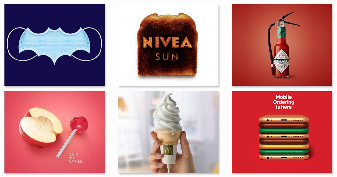
It's said that the average attention span of shoppers is nearly 8 seconds. As the screen gets smaller and the attention span more frayed, it becomes even more critical to use impactful visuals that catch shopper's attention. Unlike desktop, on mobile, you have a significantly finite area to communicate your product's USPs and persuade your shoppers to purchase. To ensure this decision-making process isn't very complex, limit the amount of copy to absolute essential and rely on visuals instead. More real-life shots of your products and various lifestyle and Amazon infographic images might also give your shoppers the extra boost of confidence they need to click on the "Add to Cart" button. Here are some great examples of the phrase, "Let your images do the talking."
Tip #3: Identify the modules/tiles that work best on mobile
Mobile optimization for Enhanced Brand Content & Storefront simply starts with choosing a layout that looks identical on both screens. Most of the time, the EBC/Storefront layout for mobile screens is split into sections to fit the constraints of a small screen. Because of this, the layout is ruined and requires endless scrolling, leading to a frustrating shopping experience and page abandonment. To avoid this, simply skip any designs that are non-mobile friendly.
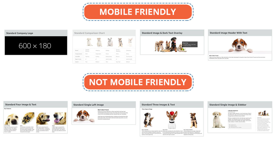
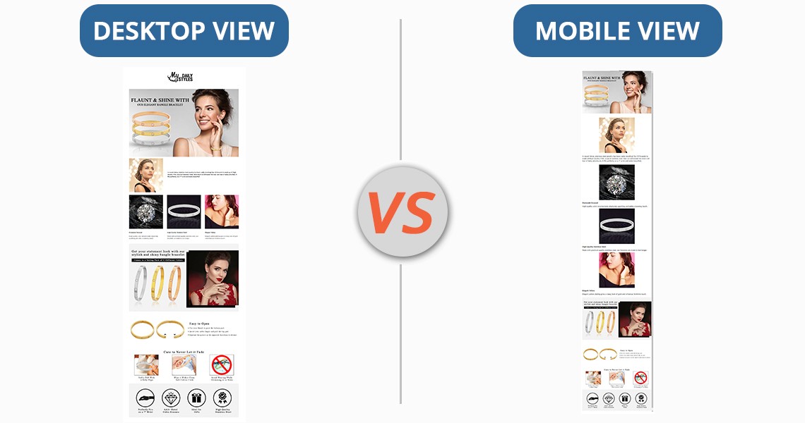
Storefront has various types of tiles (image, text, product, and videos), while EBC has various modules. Out of 17 EBC modules that look pitch-perfect on a desktop, only a couple of them are mobile-friendly. The "Standard Image & Light/Dark Text Overlay" or "Standard Image Header With Text" are the modules you should be using the most if you want to make your Amazon Enhanced Brand Content design mobile friendly.
Same goes for storefronts; there are about a dozen ways to add tiles and design your storefront. The final output would look great on desktop but crappy on mobile. To make sure that your storefront looks flawless on mobile & desktop, use the "Split Section" option to the minimum. The Split Section option allows you to add multiple tiles in various layouts. While it might sound tempting to use the split Section feature of your storefront, it does not go very well with mobile devices. Any image, text, or product tiles you add in the Split Section feature are stacked on top of one another and, as a result, do not look at all attractive.
While choosing modules or tiles for your EBC or Amazon seller storefront, remember one simple rule: Any module that allows you to add text outside of images is not mobile-friendly. Here's why. When you add text outside of images, Amazon will split the text and images for mobile view and this will require your shoppers to scroll more. Look at the image below and you'll understand what we mean.
Whether it's storefront or EBC, the banners always look great on both desktop and mobile, as long as you have designed them well with less text and sharp visuals. So, the "Standard Image & Dark Text Overlay" or "Standard Image Header With Text" in EBC and "3000 x 1500 Image tile" in the storefront look great on both mobiles and desktops. Another benefit of using such banners is that you can customize them with your brand fonts and colors. This is something you cannot do in the modules and tiles with standard Amazon text.
Tip #4: Apply the mobile-first approach
Most sellers design and optimize their graphics for desktops first and don't bother to find out how the images look on mobile. This is why they don't identify the problem with the images, but their customers end up having a frustrating purchase experience. To make sure your images look equally great on desktops AND mobiles, check how they look on smaller screens first and then move forward. This way, you'll please a large chunk of shoppers by giving them an excellent purchase experience. Mobile previews are available for both EBC and Storefront, so you can visualize how your designs will look on mobile devices before actually uploading them on the live page.
Tip #5: Keep your copy to-the-point; get rid of the fluff

Whether it's listing images, Enhanced Brand Content, or Storefront, everything is incomplete without a copy. Given that your mobile screens have only 4 inches of display, there is limited real estate for the message you want to convey. Because the text is extremely difficult to accommodate on smaller screens, it becomes obvious to apply the "less is more" principle. Get rid of the fluff and use short yet catchy taglines and small texts that convey your message but don't take up too much space.
If you are not careful with the amount of text you add to your visuals, they'll end up looking clumsy and complex. Sellers attempt to fit a lot of text in EBC and Storefront, thinking it will benefit their organic ranking. Unfortunately, that doesn't play out very well. Amazon won't index your EBC and storefront anyway and you will reduce your conversion rates. Besides, when your EBC/Storefront is text-heavy, it will shrink on mobile screens and will be difficult to read.
Tip #6: Leverage videos

Images can be extremely tricky to use on mobile devices and they take a ton of your precious space on the screen. Videos, however, can educate and engage your visitors without disrupting the design or customer's experience. Explainer videos, for instance, can make complex information easy to digest. You can also create product-specific videos to demonstrate the USPs of your product and even create mini commercial-type videos to better engage the shoppers. You can also use videos for Amazon Sponsored Ad. Please note that you can add videos only in your Storefront and listing images and not EBC.
Tip #7: Not just mobiles but make your visuals all-device friendly
Maybe someone's shopping from their office using their desktop, or perhaps someone's using an iPad. While most shoppers use mobile, there are still a lot of shoppers who rely on other devices. Don't keep your approach "mobile-only," or you'll end up upsetting everyone who is not shopping from mobile. Trust me, whether it's one or one thousand, upsetting any shopper isn't going to take you anywhere. Aim to create responsive designs and create multiple test drafts to identify how your images look on different devices.
Have you optimized your visuals for mobile yet?
Optimizing for mobile isn't a fad anymore. It's an excellent way to boost conversions and gain a competitive advantage. When you reduce friction in the mobile shopping experience, you'll end up with more happy customers and less frustrated ones. Sure optimizing images for mobile is an extra step that demands your time and resources, but the potential benefits make it all worth it. You can either follow these 9 tips to make your visuals mobile-friendly, or you can hire our Amazon consultants who already know how to create mobile-friendly graphics for your store.
"When you are forcing your shoppers to pinch and zoom, you are telling them to go somewhere else."
When was the last time you shopped from a desktop app? Probably a long time ago. Just like you, shoppers around the globe are inclining towards mobile shopping, and if you don't adapt, good luck getting good conversion rates. Mobile shoppers are increasing every minute, yet while creating visuals for our Amazon store, we often don't consider how they will look and resonate with shoppers on a smaller screen. But it’s high time we take our mobile shoppers seriously.
Here are some tips for optimizing Amazon visuals for mobile:
Tip #1: Get off that large desktop display & think small
Fancy graphics, icons, and tens of lines of sugar-coated copy, all look great on desktop, but they can practically ruin the look of your design on mobile screens. TMI & TMG (too many graphics) can overwhelm your shoppers while a cleaner design makes your product stand out and highlights it as the real protagonist. You might have elements in your EBC/Storefront that won't convert well to mobile devices. Take, for example, a small text paragraph. On desktop devices, it educates your shoppers about the product, but on mobile devices, a small text paragraph is hard to read — again, without pinching the screen, which leads to a poor shopping experience. Remove any unnecessary clutter, streamline the design, and if you can remove a design element without losing essential information, do so.
Tip #2: Smaller screens = sharper visuals
It's said that the average attention span of shoppers is nearly 8 seconds. As the screen gets smaller and the attention span more frayed, it becomes even more critical to use impactful visuals that catch shopper's attention. Unlike desktop, on mobile, you have a significantly finite area to communicate your product's USPs and persuade your shoppers to purchase. To ensure this decision-making process isn't very complex, limit the amount of copy to absolute essential and rely on visuals instead. More real-life shots of your products and various lifestyle and Amazon infographic images might also give your shoppers the extra boost of confidence they need to click on the "Add to Cart" button. Here are some great examples of the phrase, "Let your images do the talking."
Tip #3: Identify the modules/tiles that work best on mobile
Mobile optimization for Enhanced Brand Content & Storefront simply starts with choosing a layout that looks identical on both screens. Most of the time, the EBC/Storefront layout for mobile screens is split into sections to fit the constraints of a small screen. Because of this, the layout is ruined and requires endless scrolling, leading to a frustrating shopping experience and page abandonment. To avoid this, simply skip any designs that are non-mobile friendly.
Storefront has various types of tiles (image, text, product, and videos), while EBC has various modules. Out of 17 EBC modules that look pitch-perfect on a desktop, only a couple of them are mobile-friendly. The "Standard Image & Light/Dark Text Overlay" or "Standard Image Header With Text" are the modules you should be using the most if you want to make your Amazon Enhanced Brand Content design mobile friendly.
Same goes for storefronts; there are about a dozen ways to add tiles and design your storefront. The final output would look great on desktop but crappy on mobile. To make sure that your storefront looks flawless on mobile & desktop, use the "Split Section" option to the minimum. The Split Section option allows you to add multiple tiles in various layouts. While it might sound tempting to use the split Section feature of your storefront, it does not go very well with mobile devices. Any image, text, or product tiles you add in the Split Section feature are stacked on top of one another and, as a result, do not look at all attractive.
While choosing modules or tiles for your EBC or Amazon seller storefront, remember one simple rule: Any module that allows you to add text outside of images is not mobile-friendly. Here's why. When you add text outside of images, Amazon will split the text and images for mobile view and this will require your shoppers to scroll more. Look at the image below and you'll understand what we mean.
Whether it's storefront or EBC, the banners always look great on both desktop and mobile, as long as you have designed them well with less text and sharp visuals. So, the "Standard Image & Dark Text Overlay" or "Standard Image Header With Text" in EBC and "3000 x 1500 Image tile" in the storefront look great on both mobiles and desktops. Another benefit of using such banners is that you can customize them with your brand fonts and colors. This is something you cannot do in the modules and tiles with standard Amazon text.
Tip #4: Apply the mobile-first approach
Most sellers design and optimize their graphics for desktops first and don't bother to find out how the images look on mobile. This is why they don't identify the problem with the images, but their customers end up having a frustrating purchase experience. To make sure your images look equally great on desktops AND mobiles, check how they look on smaller screens first and then move forward. This way, you'll please a large chunk of shoppers by giving them an excellent purchase experience. Mobile previews are available for both EBC and Storefront, so you can visualize how your designs will look on mobile devices before actually uploading them on the live page.
Tip #5: Keep your copy to-the-point; get rid of the fluff
Whether it's listing images, Enhanced Brand Content, or Storefront, everything is incomplete without a copy. Given that your mobile screens have only 4 inches of display, there is limited real estate for the message you want to convey. Because the text is extremely difficult to accommodate on smaller screens, it becomes obvious to apply the "less is more" principle. Get rid of the fluff and use short yet catchy taglines and small texts that convey your message but don't take up too much space.
If you are not careful with the amount of text you add to your visuals, they'll end up looking clumsy and complex. Sellers attempt to fit a lot of text in EBC and Storefront, thinking it will benefit their organic ranking. Unfortunately, that doesn't play out very well. Amazon won't index your EBC and storefront anyway and you will reduce your conversion rates. Besides, when your EBC/Storefront is text-heavy, it will shrink on mobile screens and will be difficult to read.
Tip #6: Leverage videos
Images can be extremely tricky to use on mobile devices and they take a ton of your precious space on the screen. Videos, however, can educate and engage your visitors without disrupting the design or customer's experience. Explainer videos, for instance, can make complex information easy to digest. You can also create product-specific videos to demonstrate the USPs of your product and even create mini commercial-type videos to better engage the shoppers. You can also use videos for Amazon Sponsored Ad. Please note that you can add videos only in your Storefront and listing images and not EBC.
Tip #7: Not just mobiles but make your visuals all-device friendly
Maybe someone's shopping from their office using their desktop, or perhaps someone's using an iPad. While most shoppers use mobile, there are still a lot of shoppers who rely on other devices. Don't keep your approach "mobile-only," or you'll end up upsetting everyone who is not shopping from mobile. Trust me, whether it's one or one thousand, upsetting any shopper isn't going to take you anywhere. Aim to create responsive designs and create multiple test drafts to identify how your images look on different devices.
Have you optimized your visuals for mobile yet?
Optimizing for mobile isn't a fad anymore. It's an excellent way to boost conversions and gain a competitive advantage. When you reduce friction in the mobile shopping experience, you'll end up with more happy customers and less frustrated ones. Sure optimizing images for mobile is an extra step that demands your time and resources, but the potential benefits make it all worth it. You can either follow these 9 tips to make your visuals mobile-friendly, or you can hire our Amazon consultants who already know how to create mobile-friendly graphics for your store.


eStore Factory is a full-service Amazon agency dedicated to building end-to-end strategies for brands of all sizes.


SERVICES FOR AMAZON
Product Setup ON AMAZON
GRAPHICS & BRANDING SERVICES
© Copyright 2014 - 2025. All Rights Reserved.
eStore Factory is a full-service Amazon agency dedicated to building end-to-end strategies for brands of all sizes.
SERVICES FOR AMAZON
Product Setup ON AMAZON
GRAPHICS & BRANDING SERVICES
© Copyright 2014 - 2025. All Rights Reserved.
eStore Factory is a full-service Amazon agency dedicated to building end-to-end strategies for brands of all sizes.
SERVICES FOR AMAZON
Product Setup ON AMAZON
GRAPHICS & BRANDING SERVICES
© Copyright 2014 - 2025. All Rights Reserved.